Brand & art direction / AMEY & CO
Graphic design trends in 2026: stay relevant without losing your identity.
How growing businesses can use contemporary design with confidence, while protecting the recognition and trust they have already built.
Amey & Co · 3 min read ·
A trend is a starting point for a question
In its January 2026 graphic design review, It’s Nice That highlights an appetite for tactile print effects, collected imagery, technical detail and more expressive lettering. Ellis Tree presents these as observations across creative work, rather than a definitive forecast. The original feature is linked below.
For a business, the useful question is what a visual direction could help people understand or feel. A style can be interesting without being right for your brand. Our view is that relevance comes from making a deliberate choice about your audience and offer, then carrying that choice through the customer experience.
Decide what should stay recognisable
Before considering a refresh, identify what customers already associate with you. That might be a colour combination, a distinctive name, the way your products are photographed or a particular tone of voice. These elements deserve an assessment before they are replaced simply because a different approach feels newer.
Separate the enduring identity from the parts that can change more frequently. A seasonal campaign gives you room to explore a different crop, composition or photographic treatment. A primary logo has to work through many seasons, at small sizes and in everyday applications. The level of experimentation should reflect the job.
Use photography to change the energy
A direct-flash photograph can make an image feel immediate: sharp shadows, bright reflections and a sense that a moment has been caught rather than carefully softened. We would consider that treatment when the brief calls for confidence, sociability or an unvarnished view of a product or place. It is an art-direction choice, not a universal recipe.
Keep the subject in charge. For a product business, show the real shape, finish and scale even when the treatment is expressive. For hospitality, make sure the atmosphere you communicate matches the experience someone will find on arrival. An attention-grabbing image should still help the right customer make a useful decision.
Let the campaign have character and the information have clarity
A headline can be playful while a price, menu description or delivery message remains easy to read. Establish that hierarchy before filling a layout with details. The most expressive part of a composition should guide attention towards the message rather than compete with it.
Try the design in the smallest and least forgiving settings: an email on a phone, a compact advert, a product thumbnail or a printed sign viewed from a distance. If the treatment only works as a large presentation mock-up, it needs further development before it becomes a practical brand asset.
Test a creative direction across the whole journey
Build a small set of applications before approving a wider rollout. Put an advert beside its landing page and the email that follows. Ask whether the same business is recognisable in each, whether the promise remains consistent and whether the next step is obvious.
Where you test different creative approaches, decide what you want to learn. Perhaps a product demonstration explains the offer more clearly than an atmospheric image. Keep other variables as consistent as possible, and review the quality of the response alongside the number of clicks. A visual refresh is useful when it supports understanding as well as attention.
Harness AI with a clear point of view
AI can help explore a composition, develop alternative crops or produce an early visual concept. The creative responsibility remains in the brief and the selection: what belongs to this brand, what is accurate and what should reach the customer? Generating a large number of options does not remove the need to make those decisions.
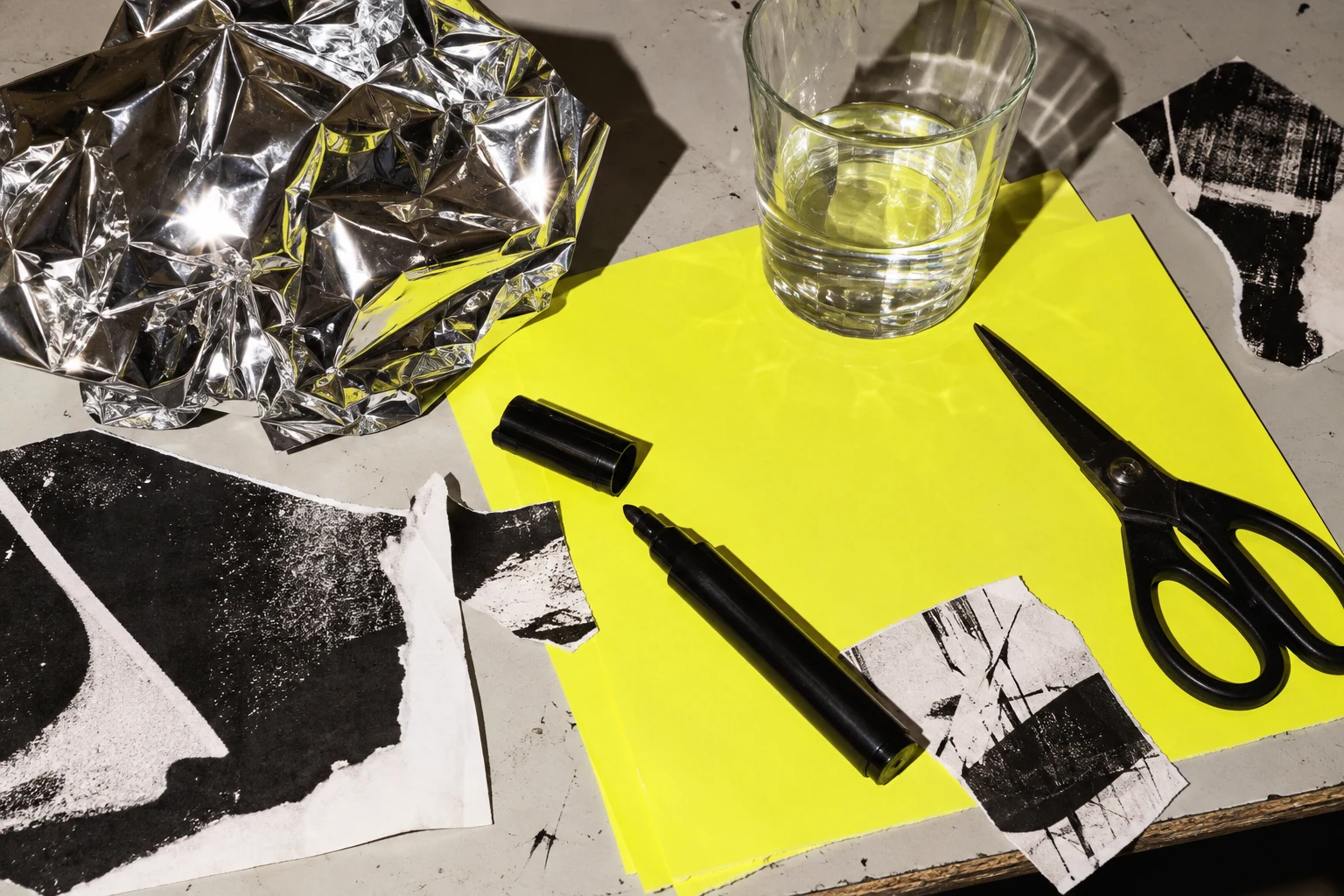
The cover for this article is an AI-generated illustration in a hard-flash photographic style. It is a concept image, rather than a documentary photograph of our studio. For client campaigns, the choice between generated imagery and commissioned photography should follow the purpose of the image and what it needs to demonstrate.
Build a brand that has room to develop
Our work for Oxford Shirt Company connects creative direction with the online store, email, sales campaigns and social strategy. That breadth makes consistency a practical concern: the brand needs to feel coherent wherever a customer encounters it, while leaving room for fresh stories and seasonal changes.
The best question to bring to a creative partner is not simply what looks current. Ask which parts of your identity are working, where the experience feels disconnected and what a new direction needs to achieve. That creates a stronger brief, and a brand that can develop without starting again every time visual tastes change.